Cancel
Start searching

This search is based on elasticsearch and can look through several thousand pages in miliseconds.
Learn more

Many websites now track every click, every login, every transaction, and every request. But user profiles, comments, likes, shares, and the like also find their way into databases. Often, however, this collected data is analyzed only by marketing teams using Google Analytics or is used by development teams for log file analysis. The information that is truly of interest to companies is often not analyzed. Yet the only thing standing between collecting and understanding data is its visual presentation.
Since it is impossible for the human mind to understand large datasets simply by looking at tabular lists, they must be presented in other ways. In classical data visualization, a whole series of processing steps is identified that are necessary to present data accurately and comprehensibly. Thus, raw data must undergo data analysis, filtering, mapping, and rendering before a presentable graphic is created.
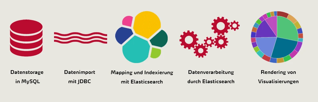
This can be achieved using data visualization tools such as Kibana. Kibana is a graphical front end specifically designed to display data from Elasticsearch. This front end retrieves data from Elasticsearch and allows users to filter the results as they wish. The result is dynamic, interactive, and engaging real-time visualizations of the data. The data stored in Elasticsearch’s document-based structure can be explored and compiled into visualizations—such as pie charts and bar charts—to create dashboards. This allows trends and relationships to emerge.
As part of my project work on data visualization, I created a proof of concept using Elasticsearch and Kibana. To do this, the data had to be transferred from the original MySQL database to Elasticsearch using a database connector, where data aggregation takes place. From there, the data is automatically transferred to Kibana when the user submits a query in the front end. This can happen as an explicit search query or through interaction with the visualizations. The visualizations on a dashboard are then immediately updated accordingly.
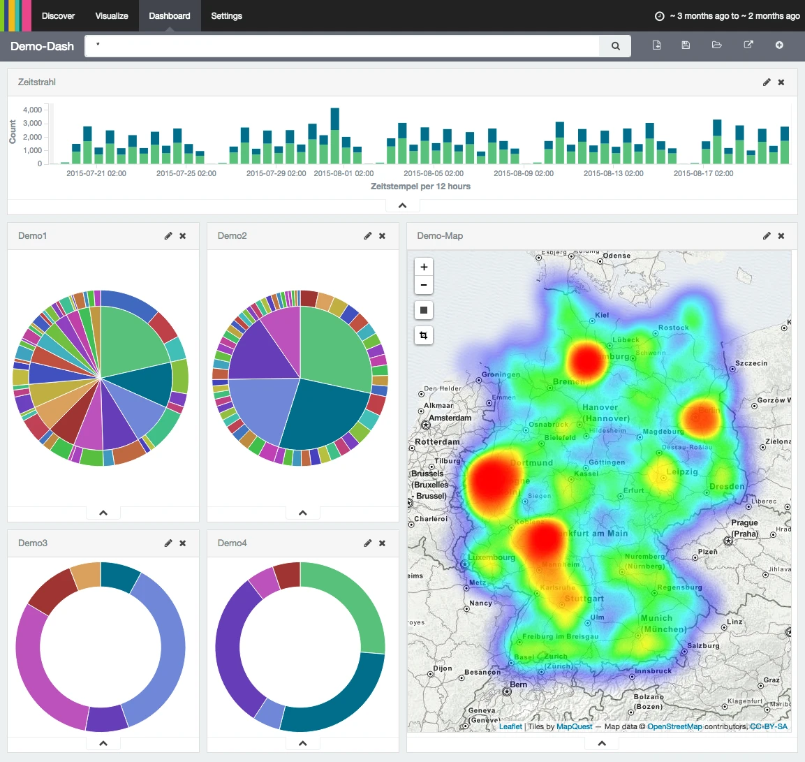
Traditionally, Elasticsearch and Kibana are used as a log analysis stack, especially in conjunction with log shippers such as Logstash or Heka. Access data, HTML responses, and error messages are then displayed there. However, there are also many other potential use cases. For example, it’s entirely possible to visualize business transactions—such as sales—on a map to identify which products are selling particularly well in specific locations. Similarly, forum posts from an online community can be analyzed to uncover trending topics.
Analyses using Elasticsearch and Kibana thus open up a wide range of possibilities for performing powerful yet intuitive analyses of a wide variety of business data. With this solution, we enable our customers to derive even more value from their data.