Cancel
Start searching
This search is based on elasticsearch and can look through several thousand pages in miliseconds.
Learn more

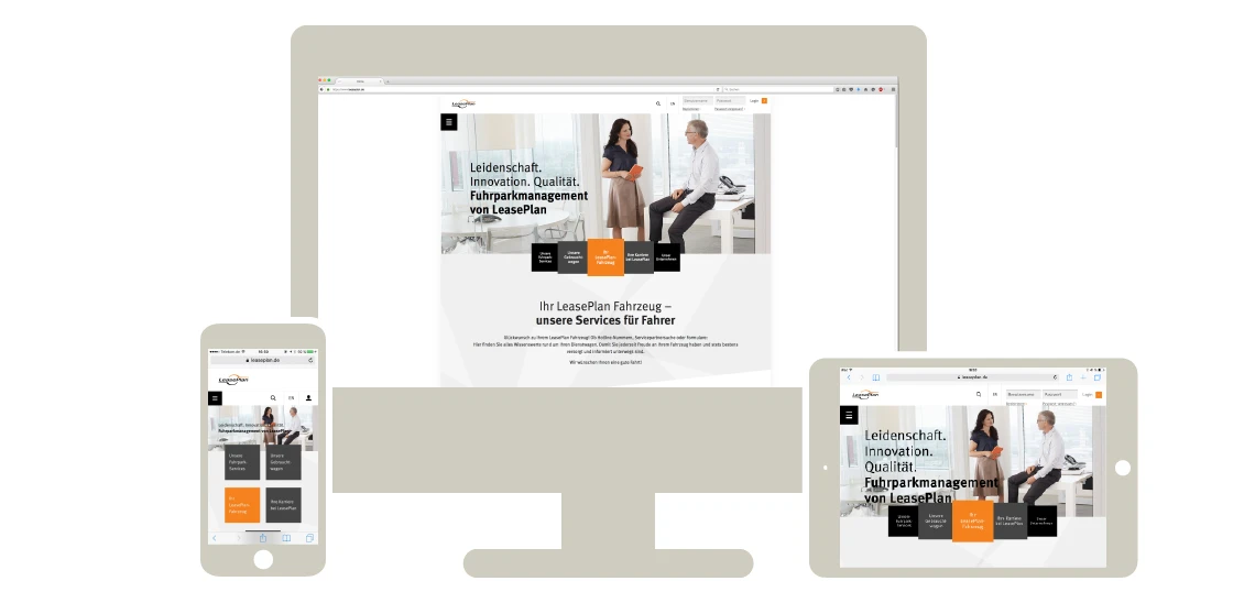
A responsive web design that offers consistent user-friendliness on desktop, tablet and smartphone: At its core, this is the solution that my team (snow) developed for LeasePlan. The dynamic website automatically recognizes which end device website visitors are using and adapts the display of content and navigation elements to the respective screen. This guarantees an optimal user experience - everywhere.
For the leasing and fleet management company, it was particularly important for company car drivers to be able to access all website content, such as the partner search or important forms, while on the move. Previously, there was a special app for this, but with the revised website, "LeasePlan Mobile" is literally "app-less" and will no longer be needed in future. As a result, it no longer needs to be updated in parallel with the website, which saves time and money. The dynamic website also brings many advantages for LeasePlan.