Cancel
Start searching
This search is based on elasticsearch and can look through several thousand pages in miliseconds.
Learn more


Welcome to the third part of our Neos tutorial. In the first part we showed how to easily set up a local development environment for Neos with Vagrant. In the second part we started a site package for our own site. This part is about the structure and configuration of custom content types.
In order to define your own content types, it is first important to understand the data structure behind Neos, so this part starts with some (exciting) theory.
All content in Neos is stored as a node in a tree structure. The structure is similar to the file system of a computer. Each node has a unique name and a type - similar to the type of a file in the file system - which determines the defined properties of the node.
The node's data is stored in its properties. Of course, each node can have further sub-nodes. The root of the tree is a special node called "Site".
This is best illustrated by a simple website with a hierarchical menu structure. Each page is represented by a node of the type "Document" - subpages of the second menu level are child nodes of the first level.
The content of the page, such as text or image elements, are also nodes that are attached to the respective page as child nodes. Content - such as a 2-column container - can also have child nodes. The content can thus be nested as deeply as required. In addition, each node can have any number of properties.
The image shows such a tree with a Home page and a "Wines from around the world" page. The pages can contain simple standard content such as text or images or a special content element, which in our example represents a wine. Such an element will be created in this part of the workshop.

Each new content type begins with the definition of its own NodeType. The data structures of the node type are defined in the YAML markup language. Meta information such as editing options, help texts and relationships to other types are also defined here. NodeType definitions can be inherited as required, whereby multiple inheritance is also possible. This makes it possible to define simple, reusable data types, which can then be combined with their properties to form larger definitions.
Neos already defines a series of abstract basic types, which specify the basic behavior of a data element.
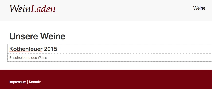
With this knowledge, we can start to create our own simple content type: this should be the presentation of a wine with title, description, image and grape variety to match the page. All files that we create in the following will be created under the site package directory. The second part of the workshop illustrates the basic structure of the site package.
It has proven to be practical to distribute NodeType definitions across several files in order to maintain a better overview. We therefore create our definition in a new file NodeTypes.Wine.yaml in the directory Configuration - it is important that the file name starts with "NodeTypes." so that Neos can automatically include it. Structures in YAML are defined solely by indentation with two spaces.
We start with a simple definition of an element with the two properties title and description as shown in the listing. The first line defines the name of the NodeType. With superTypes in the line below, we define from which other NodeTypes it is to be inherited. As it is to be a content element, the base type ContentElement is inherited here.
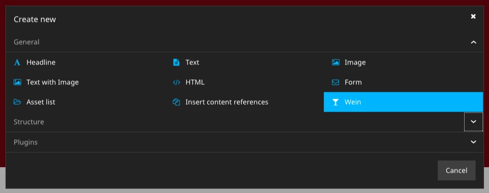
The "ui" key always contains properties that describe the interface and operating elements. The element is given a meaningful name with Label. An icon with recognition value helps the editor with the selection - all icons from the FontAwesome IconSet can be used here.
'WL.WeinLaden:Wine':
  superTypes:
    'Neos.Neos:Content': true
  ui:
    label: Wein
    icon: icon-glass
    inspector:
      groups:
        wine:
          label: Wein
  properties:
    title:
      type: string
      ui:
        label: 'Name'
        inlineEditable: true
        aloha:
          placeholder: 'Titel des Weins'
    description:
      type: string
      ui:
        label: 'Beschreibung'
        inlineEditable: true
        aloha:
          placeholder: 'Beschreibung des Weins'
Configuration/NodeTypes.Wine.yaml
Below the Inspector area, there are properties that affect the control elements in the right-hand sidebar. The control elements can be grouped together. Such a group with the label "Wine" is created here.
Next, the properties of the node are defined. The content of type "string" can be edited directly "inline" on the page, which is specified with the property inlineEditable:true. Aloha is the name of the editor that is used for this and can be parameterized here. The placeholder text defined here is displayed if no own text has been specified and thus supports the editor when editing the page.
Now it's time for the display: Neos expects the template of a NodeType by convention in the directory Resources/Private/Templates/NodeTypes/<nodeTypeName>.html - nodeTypeName is "Wine" in our case.
{namespace neos=Neos\Neos\ViewHelpers}
<div {attributes -> f:format.raw()}>
	<neos:contentElement.editable property="title" tag="h3" />
	<neos:contentElement.editable property="description" tag="p" />
</div>
In the first line, we import the ViewHelper from the neos namespace, which we need to display the editable elements. We use the "contentElement.editable" ViewHelper to create editable HTML elements for the previously defined properties. The heading is rendered with the H3 tag and the text with a paragraph.
The first custom content element is ready, which can now also be integrated on the page.
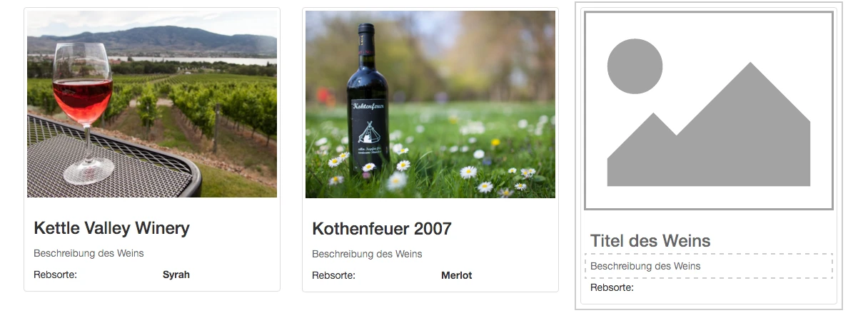
Let's move on to the second round - in this round we want to add the grape variety and an image to the wine content element.
The grape variety should not be entered as free text, but should be selected from a list of predefined varieties. This cannot be done directly on the page, so the Inspector is configured in the right-hand sidebar from line 9.
The new field is added to the "wine" group. The editor should be of the type"SelectBoxEditor ", which displays a selection field for the values configured under"values".
On to the image. This is specified with the type "ImageInterface". Specifying the type also ensures that an editor is available for uploading or selecting an image from the media module.
This editor can also be adapted to your own requirements. In our case, we want all images to be displayed with the same aspect ratio. If an image with a different aspect ratio is uploaded, it should be cropped automatically.
Which part of the image is then displayed can be determined individually by the editor. To do this, we define a crop with a fixed aspect ratio (aspectRatio) of 3 to 2 under editorOptions.
    grape:
      type: string
      ui:
        label: Rebsorte
        help:
          message: Hier bitte die Rebsorte wählen
        reloadIfChanged: true
        inspector:
          group: wine
          editor: Neos.Neos/Inspector/Editors/SelectBoxEditor
          editorOptions:
            values:
              Merlot:
                label: Merlot
              Syrah:
                label: Syrah
              Chardonnay:
                label: Chardonnay
    image:
      type: Neos\Media\Domain\Model\ImageInterface
      ui:
        label: Bild
        reloadIfChanged: true
        inspector:
          group: wine
          editorOptions:
            crop:
              aspectRatio:
                locked:
                  width: 3
                  height: 2
In this case, the easiest way to render the image element in the template is with the Neos image partial. To use this, the PartialRootPath must be set to the correct directory using Fusion. To do this, we create a new Wine.fusion file under Resources/Private/Fusion/NodeTypes/ and add the following lines:
prototype(WL.WeinLaden:Wine) < prototype(Neos.Neos:Content) {
    partialRootPath = 'resource://Neos.NodeTypes/Private/Templates/NodeTypes/Partials'
}
Resources/Private/Fusion/NodeTypes/ Wine.fusion
This defines a new Fusion prototype for our content element, which is used for rendering. By inheriting the base type "Content", we adopt some basic settings for the display of a content element, which we can now overwrite or extend for our own element.
We include this file (as well as all other files in the NodeTypes directory) with the following line at the end of the Root.fusion file
include: NodeTypes/*The template of our content element can then be expanded to include the additional data. To display the image, we now use the image partial. This requires the image object and a text for the alt tag as the minimum number of arguments.
{namespace neos=Neos\Neos\ViewHelpers}
<div {attributes -> f:format.raw()}>
    <div class="thumbnail">
        <f:render partial="Image" arguments="{image:node.properties.image, alt:node.properties.title, maximumWidth:1600}" />
        <div class="caption">
            <neos:contentElement.editable property="title" tag="h3" />
            <neos:contentElement.editable property="description" tag="p" />
            <div class="row">
                <div class="col-md-6">Rebsorte:</div><div class="col-md-6"><b>{node.properties.grape}</b></div>
            </div>
        </div>
    </div>
</div>
Resources/Private/Templates/NodeTypes/Wine.html
The images in our content element are thus initially output in the full original resolution. However, the resolution can be limited to a reasonable level for our use case with the additional arguments maximumWidth and maximumHeight to the image partial.
Our new content element would look great in a column of a multi-column container. Neos already comes with containers for 2, 3 and 4 columns as standard. However, in order for these to be rendered in such a way that the markup and the CSS classes used match the Bootstrap framework used here, a few minor adjustments need to be made.
The adjustments are also a good way to get to know a little more of the functionality of Eel and FlowQuery.
We overwrite the NodeType definition of the multi-column container that Neos provides in our own file NodeTypes.BootstrapAdjustments.yaml.
In the options for the column layout, the previous entries with a tilde (~) are removed and the specifications for the Bootstrap 12-column grid are entered instead.
In the next step, we also overwrite the Fusion prototypes of the multi-column container and the individual column in order to render the CSS classes for the Bootstrap grid.
The "attributes" array is present in all content types that inherit from the definition Neos.Neos:Content . By convention, "attributes" is rendered in the outer HTML tag of the content element.
In the prototype Neos.NodeTypes:MultiColumn we simply set the CSS class "row" here In the NodeType Neos.NodeTypes:MultiColumnItem it gets a little more exciting. Each column requires a class that defines its width. From the selected value for the layout "9-3", the CSS class "col-md-9" is to be generated for the first column and "col-md-3" for the second column. To do this, we split the layout value with the eel helper String.split() at "-" and use the value with the corresponding column index for each column.
'Neos.NodeTypes:TwoColumn':
  properties:
    'layout':
      defaultValue: '9-3'
      ui:
        inspector:
          editorOptions:
            values:
              '50-50': ~
              '75-25': ~
              '25-75': ~
              '66-33': ~
              '33-66': ~
              '9-3':
                label: '75% / 25%'
              '6-6':
                label: '50% / 50%'
              '3-9':
                label: '25% / 75%'

'Neos.NodeTypes:ThreeColumn':
  properties:
    layout:
      defaultValue: '4-4-4'
      ui:
        reloadIfChanged: true
        label: ''
        inspector:
          editorOptions:
            values:
              '33-33-33': ~
              '50-25-25': ~
              '25-50-25': ~
              '25-25-50': ~
              '4-4-4':
                label: '33% / 34% / 33%'
Configuration/NodeTypes.BootstrapAdjustments.yaml
prototype(Neos.NodeTypes:MultiColumn) {
    attributes.class = 'row'
    columns.iterationName = 'multiColumnIteration'
}

prototype(Neos.NodeTypes:MultiColumnItem) {
    attributes.class = ${'col-md-' + String.split(q(node).parent().property('layout'), '-')[multiColumnIteration.index]}
}
Fusion/NodeTypes/BootstrapAdjustments.fusion
In this part of the workshop, we saw how to define custom NodeTypes in YAML and render them with Fusion and Fluid, as well as how to easily extend and customize existing NodeTypes. The complete status of the site package can be found in the GitHub repository for the workshop .